
The beta client UI: an update
Hello, Habbos 👋
As many of you know, for some time now we've been using almost exactly the same UI for both the beta desktop and mobile clients (the beta client was previously known as the “Modern” client). This obviously isn’t ideal given their fundamentally different usage.
Going forward, we’ll be enhancing and optimising the desktop and mobile client UIs independently to better cater to their respective player profiles. This approach will ensure that both desktop and mobile users of the beta client will enjoy an improved Habbo playing experience.
In this article, we wanted to share the progress we’ve made, while also explaining the more prominent differences between the desktop versions of the beta client and the Classic client.
Above picture: the new hotel view.
🖥️ The main changes, and why we’re making them
One significant change that we imagine will catch the eye of the community is the migration of the friends list, messages, and the “Me” button to a new segment on the left hand side of the UI.
This new section is very similar to the mobile app’s vertical mode, known as the Habbo Messenger. While you can’t drag this new section of the UI, you can always close it when you’re not using it.
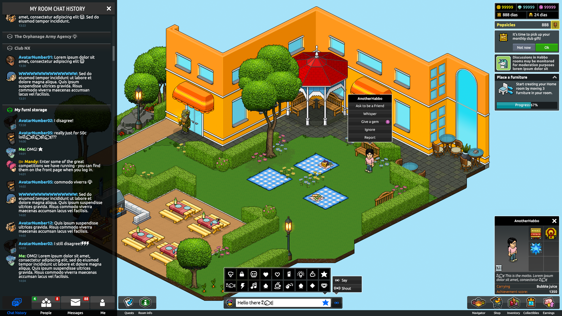
The chat history window will inherit a lot of the improvements we’re making to messaging and chat with the Habbo Messenger. This will benefit players and the game’s overall health long term because you’ll get a unified messaging experience on both platforms, which means a more cohesive Habbo experience whether you’re playing at home or on the move.
Your friends list will also migrate to the left hand side. Note that you’ll still be able to drag and resize your private message windows:
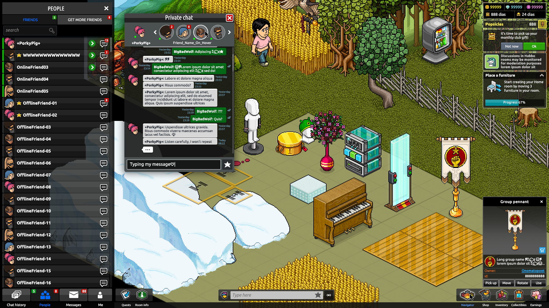
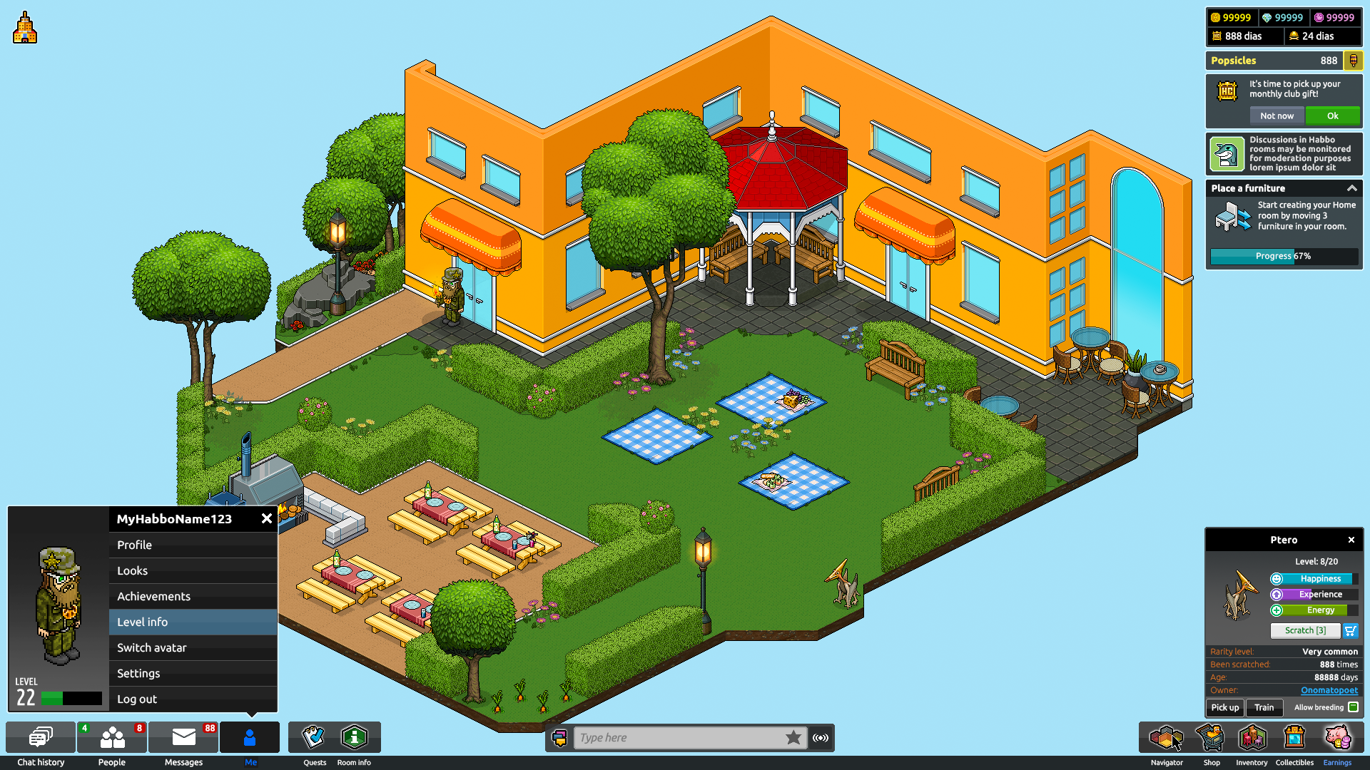
Then, finally, the “Me” button will also move to the left hand side.
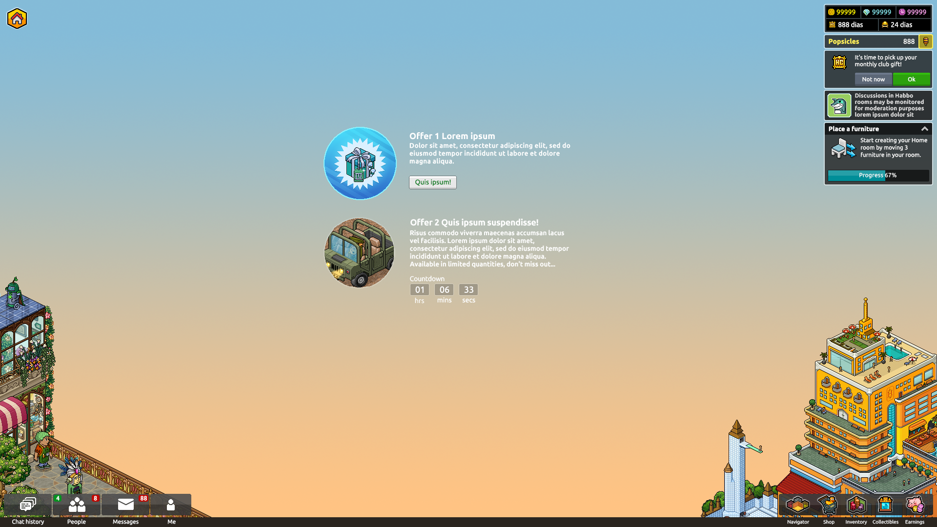
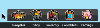
Something we’re happy to be adding is the Earnings window in a more prominent position. While we removed the Vault, the Earnings window remained as we felt it was a useful way for Habbos to keep track of what they’re getting, and from where.
Another small improvement for those players who are interested in Habbo Collectibles is that you won’t have to dig into this to open the Collectors Guild anymore – the Collectibles button will be located with all of the other main features in the bottom right hand corner.
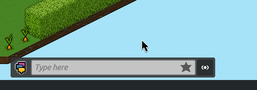
Then, finally, it’ll be easier for you to use alt codes while you’re chatting in the Hotel:
🛣️ Other, long term improvements
Long term, the team is also focusing on improving the technical structure of the UI, as well as its scalability. Improving these two aspects will give us much better control over future possible updates and features we introduce to the game.
Updating the desktop and mobile client UIs separately will also mean we can make mobile-specific improvements to the mobile app much more easily. Again, in the long term this should help us to drastically improve the mobile Habbo playing experience!