Easter furni design competition WINNERS
We had a ridiculous amount of fun looking through all of the furni you designed. So much talent and creativity exists within this community, THANKS TO ALL THAT PARTICIPATED 🫶
👨🏻🎨 A note from Stronghandle
Happy Easter everyone!
Granted Easter is still roughly a week away still as I write this. I would say that this contest has been a success. We got a lot of submissions, and at least my understanding is that there were lot of people who don't normally dabble in this particular art form trying for the first time. That is great! Hopefully if there's a next time we have another wave of new artists, too.
"New" usually means that the technical aspect of a piece is quite not up there with the more experienced artists and their entries, but everyone has to start somewhere. Keep on practicing if you found pixelling any fun, I hope that we will have more art contests like this in the future and who knows if you will be the king of the hill next time!
I wanted to open up my judging process a little bit generally here in the foreword even though I have small specific comments for the top ten placements as well.
I did the judging in waves, first picking everything up that was sound technically and were inside the lines of the rules. As an artist I am happy to say you people followed the rules and did not submit almost any AI generated stuff! If something got past me though I will apologize and admit defeat to our machine overlords.
I wanted to encourage fully original entries, so I did dock some imaginary points (I did not have any number grading) for blatantly reused assets, like straight up recolors of existing stuff. Now, that does not mean that you couldn't use the existing stuff in your work (we do it officially too). The usage just needs to look great and/or be more subtle about it. Main point being, I wanted to at least try awarding you guys for drawing your own stuff, even when using existing assets is technically easier. And there are stuff made with existing assets in these winners too, so it was not a complete deathblow.
Then I had to start grading to get the placements. Have you ever judged and ranked stuff which is very much subjective like art? It is really hard!
Finally I think I have chosen a spread of artwork which both looks nice and fits Habbo. The margins are thin and subjectivity is a thing, so I bet everyone reading this could have a different order of the top 10, or have something in the top 20 selection in their top 10 instead of what I have picked. There are some designs which are riding that high with the concept of the idea, some are just technically really sound, some are just funny to me. Hopefully you at least somewhat agree with me! And congratulations to all the winners. Keep on pixelling!
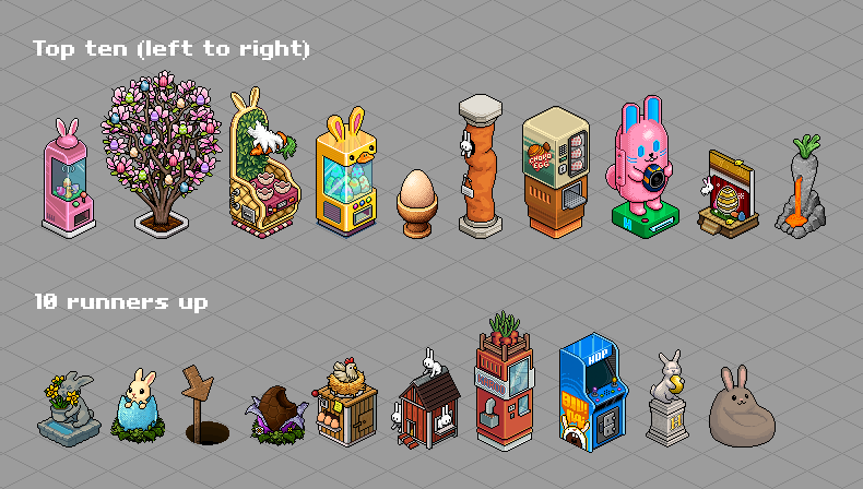
🏆 Winners
1. King Ken (.COM)

People say "Simple is best", and that shows in this piece for me. It is fun, and the design is really sleek. Technically it is also really solid, and while the rendering might be bit on the modern side, it being so simple does not clash with the origins style in my eyes.
2. Shrimp (.COM)
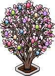
This looks really nice, and it is also the biggest legal submission in size. Plantlife can be real tricky to do and this is really well executed. Stylistically would not fly in the modern game, but I would say its a fit in Origins.
3. Rox (.COM.BR)
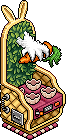
This is this high in the rankings mostly because of the technicals. Very decorated for a possible Origins furni, but I do think it still fit pretty well when checked against a room. And I do like the concept a lot. The bunny claw as an element took a little bit to get used to but I like it now.
4. Mierdinsky (.ES)

This one is funny and cute. You might notice it is also a gachapon machine! It was a popular idea, there were couple others that did not make this top 20 selection you see here today. I tried not to penalize anyone for having same basic idea, since easter is somewhat restricting theme and there is only so much you can do, so why is this lower than our overall winner? For me it came down to that I felt that the winner was more in line with origins style with being simpler and sleeker. I do think the duck-bunny combo is more fun though.
5. Eugeen (.COM)
![]()
This one is this high almost purely because of the idea of it being a dice. Such a fun concept. There is looot of dithering going on in this, which would not fly at all in the base Habbo, but this is Origins so its fine. I do like to overuse dithering in my spare time too.
6. Hermis (.COM)
![]()
This one scored lot of humor points for me (again, not actually not using numbers). Also it is really cute. Fun reuse of the pillar.
7. Marcos (.COM.BR)

Clean take of a dispenser/hand item giving furni. In the foreword I did say that I wanted to "discourage" using existing assets, but in my opinion this has used them well enough and mixed them around to not be "angry" about it.
8. GuReiPanda (.COM.BR)

This one has a cute design and the idea of it being a trax-machine is fun. However it did not quite fit the style of Origins enough to place higher (even though top 10 is high) for me even with the great technical execution.
9. Spirit-sea (.ES)

This had a nice panoramic feel to it, with a cute idea. I liked how it does reference the theatre as a space, even though easter decorated theatre had green curtains 😉
10. Vincent (.COM)
![]()
This is a clever and unique idea that's been well executed. However, the "off" state is a bit lacking. If this were implemented in the hotel, I'd probably keep it "on" all the time and use a different indicator for when the handitem is given. It would definitely complement some of the furni sets that haven't been introduced in Origins yet.
10 runners up (in no particular order):
Steve (.COM)

Deactivate! (.COM)

Wilf (.COM)
![]()
Expired (.COM)

XII (.COM)

kickass (.COM)

Nawatex (.COM)

Jeca (.COM)

Toad (.COM)
![]()
Harryporter (.COM)

We’re aiming to get the prizes out to our amazing winners today or tomorrow! THANKS AGAIN FOR PARTICIPATING!